# A tibble: 1 × 3
  terms     value id
  <chr>     <dbl> <chr>
1 lead_time 0.178 YeoJohnson_FgnP3Build better data (II)
Lecture 6
Dr. Benjamin Soltoff
Cornell University
INFO 4940/5940 - Fall 2025
September 11, 2025
Announcements
Announcements
- Homework 02
Learning objectives
- Identify potential issues with numeric predictors
- Implement transformation methods to mitigate issues with numeric predictors
- Identify the importance of interaction terms in predictive models
- Introduce non-linear transformations for numeric predictors
- Model interactive and non-linear relationships between predictors and the response variable
Problems with numeric predictors
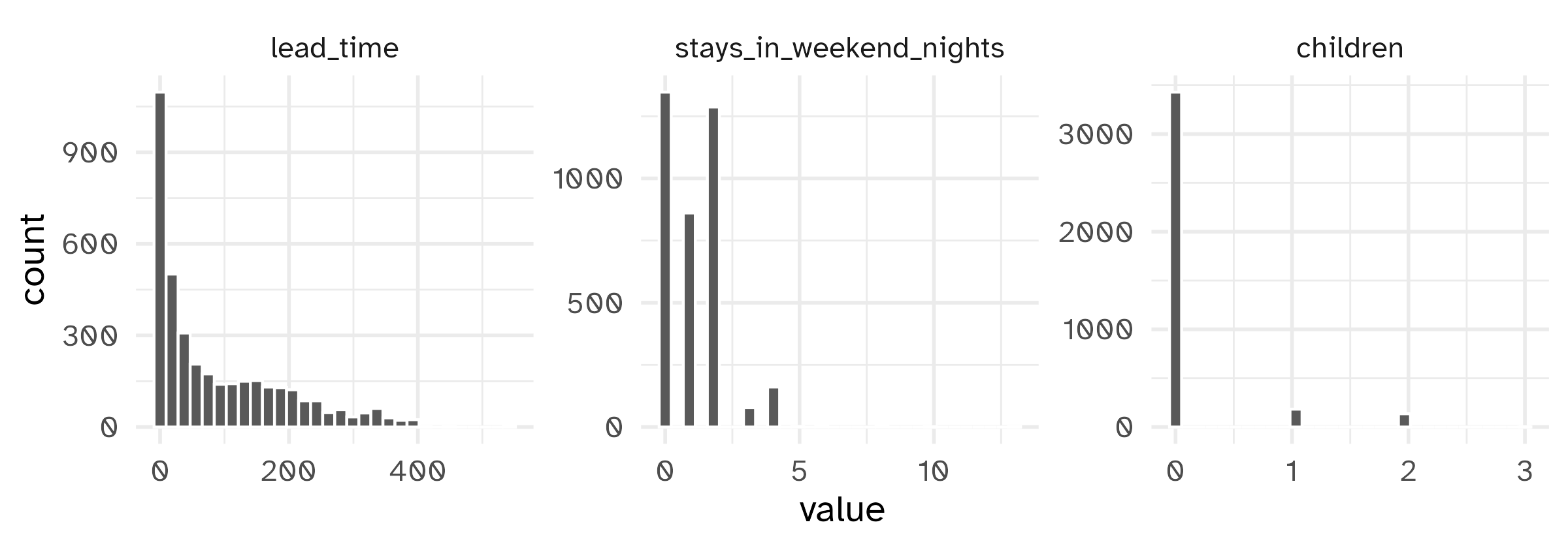
Potential issues with numeric predictors
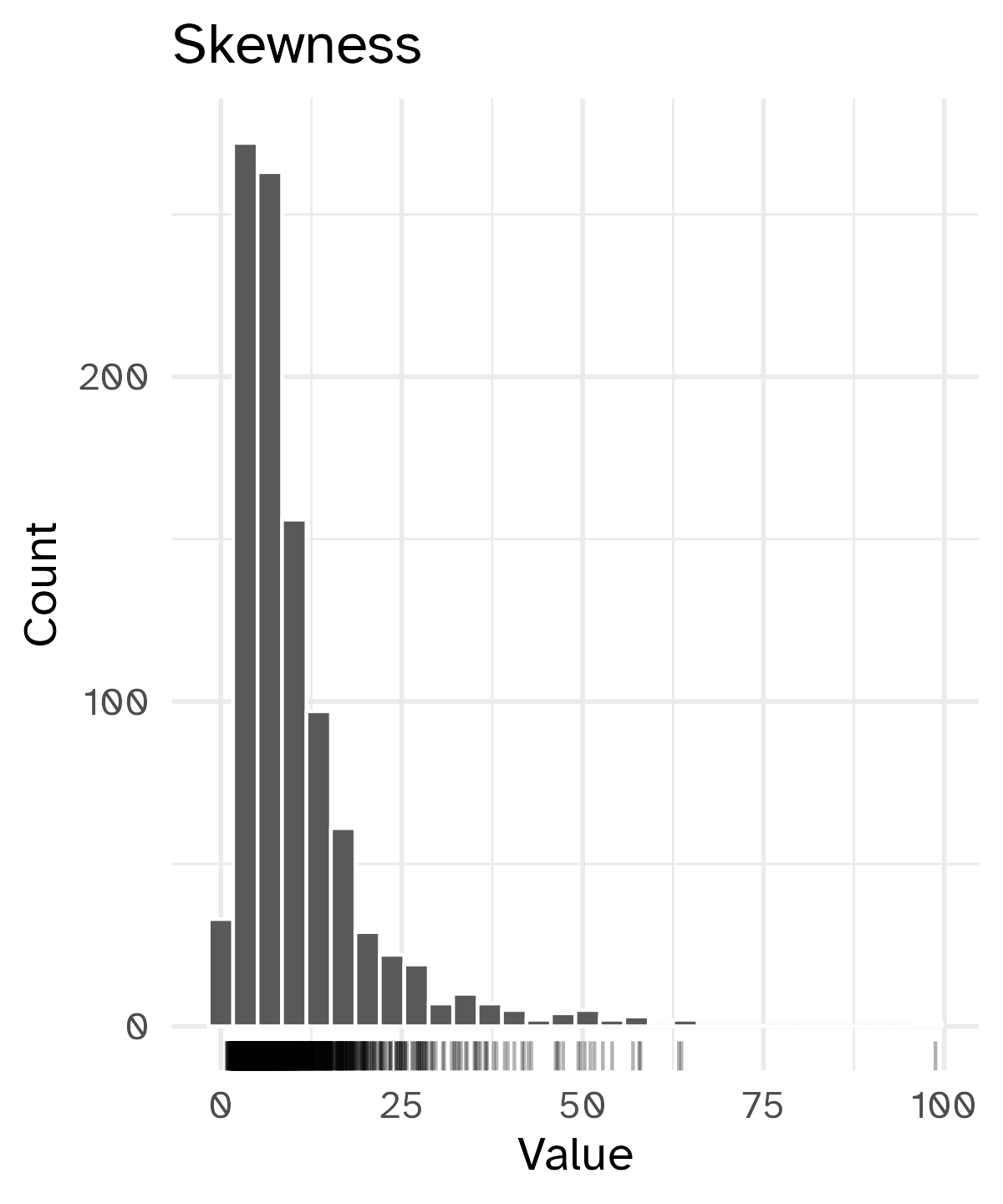
Skewed variables
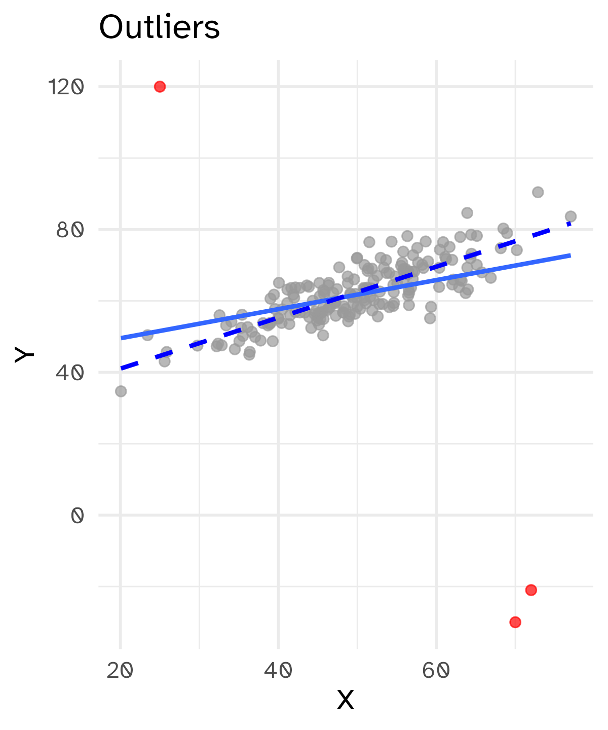
Outliers
Something (such as a geologic feature) that is situated away from or classed differently from a main or related body.1
A statistical observation that is markedly different in value from the others of the sample.2
Extreme values are not inherently “wrong”. Removing them can also skew our analysis by excluding relevant data points.
But we also do not want to give abnormal weight to these outliers.
📝 What to do with outliers?
Instructions
Options
- Keep as-is
- Remove completely
- Cap/truncate values
- Transform the variable
07:00
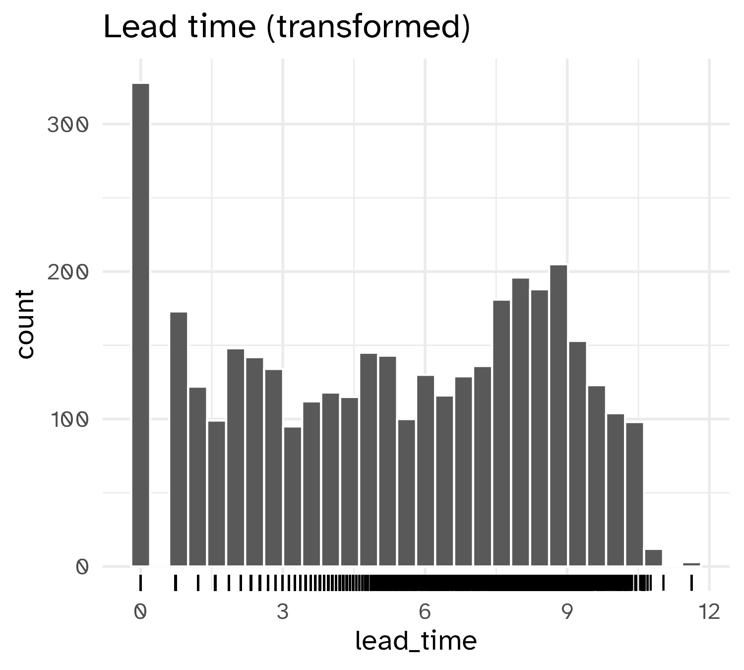
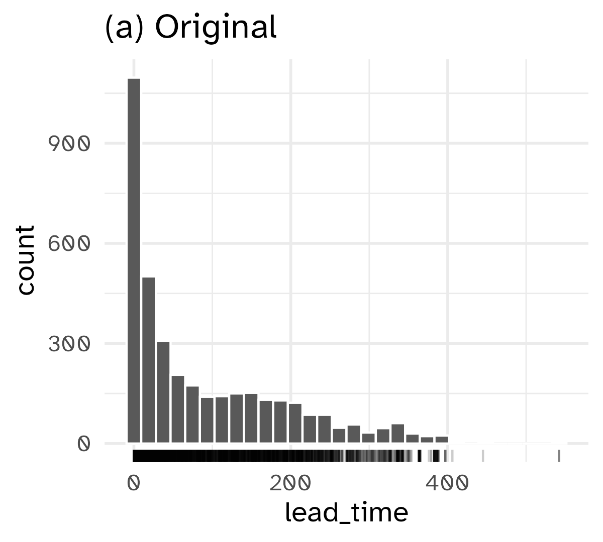
1 : 1 transformations
One-to-one functional transformation of a single predictor \(x\) to a new predictor \(x^*\)
\[ x^* = f(x) \]
Preserve relative ordering of values while resolving asymmetry or skewness
Transformation functions
Transformation functions
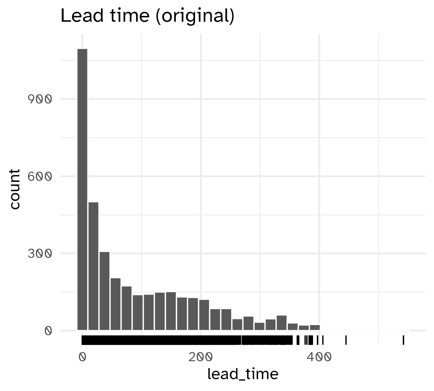
Box-Cox procedure
\[ x^* = \begin{cases} \lambda^{-1}(x^\lambda-1) & \text{if $\lambda \ne 0$,} \\[3pt] \log(x) &\text{if $\lambda = 0$.} \end{cases} \]
Box-Cox procedure
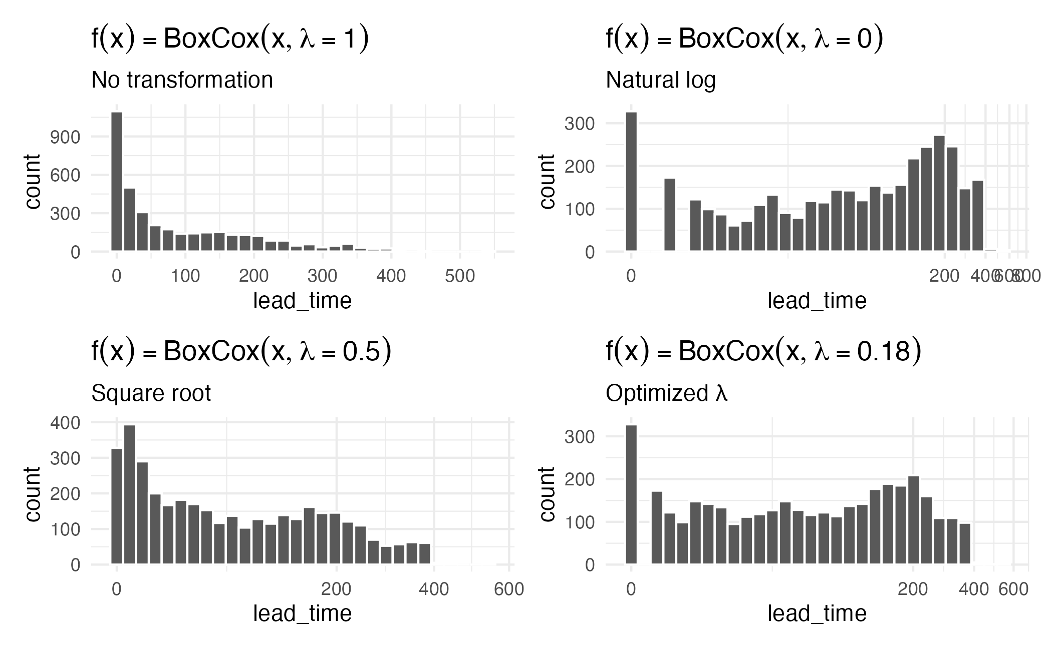
Yeo-Johnson
- Box-Cox transformations only work on positive values
- Yeo-Johnson extends this to work with all numeric values
\[ x^* = \begin{cases} \lambda^{-1}\left[(x + 1)^\lambda-1\right] & \text{if $\lambda \ne 0$ and $x \ge 0$,} \\[3pt] \log(x + 1) &\text{if $\lambda = 0$ and $x \ge 0$.} \\[3pt] -(2 - \lambda)^{-1}\left[(-x + 1)^{2 - \lambda}-1\right] & \text{if $\lambda \ne 2$ and $x < 0$,} \\[3pt] -\log(-x + 1) &\text{if $\lambda = 2$ and $x < 0$.} \end{cases} \]
How is \(\lambda\) determined?
\(\lambda\) is a parameter to be learned from the data - what value of \(\lambda\) results in the best approximation to a normal distribution?
- Training data used to estimate model parameters
- Training data used to estimate transformation parameters
Result of transformation
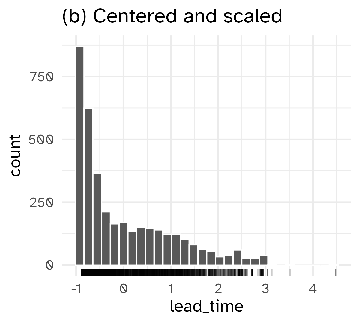
Standardizing to a common scale
Some models require predictors to be on a common scale (data preprocessing)
- \(k\) nearest neighbors
- Support vector machines
- Penalized regression
Normalization
\[ x^* = \frac{x - \bar{x}}{\widehat{\text{sd}(x)}} \]
- Use the training set (analysis set) to estimate \(\bar{x}\) and \(\widehat{\text{sd}(x)}\)
- Apply the same transformation to the test set (assessment set)
Standardizing to a common scale
Interactions
Interactive effects
\[ \Large{\hat{Y} = b_0 + b_1 X_1 + b_2 X_2 + b_3 X_3 + \ldots} \]
Assumes a linear, additive relationship between \(X_i\) and \(Y\)
What if effects are interactive?
- Temperature and humidity on energy consumption
- Drug dosage and age on treatment effectiveness
- Age and income on spending
Incorporating interactive effects
Add a product term to the model
\[ \Large{\hat{Y} = b_0 + b_1 X_1 + b_2 X_2 + b_3 \times X_1 \times X_2} \]
Interpreting interactive terms
#| '!! shinylive warning !!': |
#|   shinylive does not work in self-contained HTML documents.
#|   Please set `embed-resources: false` in your metadata.
#| label: shiny-interaction-contours
#| viewerHeight: 700
#| viewerWidth: "100%"
#| standalone: true

library(shiny)
library(ggplot2)
library(bslib)
library(viridis)
library(scales)
library(colorspace)

light_bg <- "#fcfefe" # from aml4td.scss
grid_theme <- bs_theme(
  bg = light_bg,
  fg = "#595959"
)

theme_light_bl <- function(...) {
  ret <- ggplot2::theme_bw(...)

  col_rect <- ggplot2::element_rect(fill = light_bg, colour = light_bg)
  ret$panel.background <- col_rect
  ret$plot.background <- col_rect
  ret$legend.background <- col_rect
  ret$legend.key <- col_rect

  ret$legend.position <- "top"

  ret
}

ui <- page_fillable(
  theme = bs_theme(bg = "#fcfefe", fg = "#595959"),
  padding = "1rem",
  tags$head(
    tags$style(
      type = 'text/css',
      '.irs-grid-text {font-size: 20px;}', # For grid values (min, max, ticks)
      '.irs-single {font-size: 24px;}' # For the currently selected value on the handle
    )
  ),
  layout_columns(
    card(
      sliderInput(
        "beta_1",
        label = "Predictor 1 slope",
        min = -4.0,
        max = 4.0,
        step = 0.5,
        value = 1
      ),
      sliderInput(
        "beta_2",
        label = "Predictor 2 slope",
        min = -4.0,
        max = 4.0,
        step = 0.5,
        value = 1
      ),
      sliderInput(
        "beta_int",
        label = "Interaction slope",
        min = -2.0,
        max = 2.0,
        step = 0.25,
        value = 0.5
      )
    ),
    plotOutput("contours")
  ),
  as_fill_carrier()
)

server <- function(input, output) {
  # ------------------------------------------------------------------------------

  n_grid <- 100
  grid_1d <- seq(-2, 2, length.out = n_grid)
  grid <- expand.grid(A = grid_1d, B = grid_1d)

  output$contours <-
    renderPlot({
      grid$outcome <-
        input$beta_1 *
        grid$A +
        input$beta_2 * grid$B +
        input$beta_int * grid$A * grid$B

      p <-
        ggplot(grid, aes(A, B)) +
        coord_equal() +
        labs(x = "Predictor 1", y = "Predictor 1") +
        theme_light_bl(base_size = 16)

      if (length(unique(grid$outcome)) >= 15) {
        p <- p +
          geom_raster(
            aes(fill = scale(outcome))
          ) +
          geom_contour(
            mapping = aes(z = scale(outcome)),
            bins = 15,
            color = "black"
          ) +
          scale_fill_continuous_diverging(
            guide = guide_colorsteps(
              frame.color = "black",
              ticks.color = NA,
              barwidth = 20
            ),
            mid = 0,
            name = NULL
          ) +
          theme(legend.position = "bottom")
      }

      print(p)
    })
}

app <- shinyApp(ui, server)
app
Shiny app credit: AML4D
When to include interaction terms?
Some methods capture interactions automatically
- Tree-based models (e.g. decision trees, random forests, boosted trees)
- Support vector machines
- Neural networks
- Domain knowledge
- Exploratory data analysis
- Statistical tests (e.g. ANOVA, H-statistic)
Still a combination of art and science
📝 Identifying interactive effects
Instructions
For each scenario, identify whether or not you suspect an interaction effect between the two predictors on the outcome. Justify your reasoning.
- Hotel booking prices: Season (summer vs. winter) and hotel star rating (1-5 stars) for resort hotels in western Europe.
- Student test performance: Hours of sleep and caffeine intake (0-400 mg).
- Movie theater ticket sales: Day of week (weekday vs. weekend) and movie theater capacity (100-500 seats).
07:00
Non-linear features
Basis expansion
Features of a predictor \(x\) derived from a set of functions \(f_1(x), f_2(x), \ldots, f_i(x)\) that can be combined using a linear combination.
Essentially an interaction with itself
Polynomial expansion
Simple linear regression
\[ y_i = \beta_0 + \beta_1 x_{i} + \epsilon_i \]
Cubic polynomial expansion
\[ y_i = \beta_0 + \beta_1 x_{i} + \beta_2 x_{i}^2 + \beta_3 x_{i}^3 + \epsilon_i \]
Polynomial expansion
#| '!! shinylive warning !!': |
#|   shinylive does not work in self-contained HTML documents.
#|   Please set `embed-resources: false` in your metadata.
#| label: fig-global-polynomial
#| viewerHeight: 700
#| viewerWidth: "100%"
#| standalone: true
library(shiny)
library(patchwork)
library(dplyr)
library(tidyr)
library(ggplot2)
library(splines2)
library(bslib)
library(viridis)
library(aspline)

data(fossil)

ui <- page_fillable(
  theme = bs_theme(
    bg = "#fcfefe",
    fg = "#595959",
    base_font = "Atkinson Hyperlegible",
    font_scale = 1.5
  ),
  padding = "1rem",
  tags$head(
    tags$style(
      type = 'text/css',
      '.irs-grid-text {font-size: 20px;}', # For grid values (min, max, ticks)
      '.irs-single {font-size: 24px;}' # For the currently selected value on the handle
    )
  ),
  layout_columns(
    fill = FALSE,
    col_widths = breakpoints(sm = c(-3, 6, -3)),
    sliderInput(
      "global_deg",
      label = "Polynomial Degree",
      min = 1L,
      max = 21L,
      step = 1L,
      value = 3L,
      ticks = TRUE
    ) # sliderInput
  ), # layout_columns
  layout_columns(
    fill = FALSE,
    col_widths = breakpoints(sm = c(-1, 10, -1)),
    as_fill_carrier(plotOutput('global', height = "500px"))
  )
)


server <- function(input, output, session) {
  light_bg <- "#fcfefe" # from aml4td.scss
  grid_theme <- bs_theme(
    bg = "#fcfefe",
    fg = "#595959"
  )

  # ------------------------------------------------------------------------------

  theme_light_bl <- function(...) {
    ret <- ggplot2::theme_bw(...)

    col_rect <- ggplot2::element_rect(fill = light_bg, colour = light_bg)
    ret$panel.background <- col_rect
    ret$plot.background <- col_rect
    ret$legend.background <- col_rect
    ret$legend.key <- col_rect

    larger_x_text <- ggplot2::element_text(size = rel(1.25))
    larger_y_text <- ggplot2::element_text(size = rel(1.25), angle = 90)
    ret$axis.text.x <- larger_x_text
    ret$axis.text.y <- larger_y_text
    ret$axis.title.x <- larger_x_text
    ret$axis.title.y <- larger_y_text

    ret$legend.position <- "top"

    ret
  }

  col_rect <- ggplot2::element_rect(fill = light_bg, colour = light_bg)

  maybe_lm <- function(x) {
    try(lm(y ~ poly(x, input$piecewise_deg), data = x), silent = TRUE)
  }

  expansion_to_tibble <- function(x, original, prefix = "term ") {
    cls <- class(x)[1]
    nms <- recipes::names0(ncol(x), prefix)
    colnames(x) <- nms
    x <- as_tibble(x)
    x$variable <- original
    res <- tidyr::pivot_longer(x, cols = c(-variable))
    if (cls != "poly") {
      res <- res[res$value > .Machine$double.eps, ]
    }
    res
  }

  mult_poly <- function(dat, degree = 4) {
    rng <- extendrange(dat$x, f = .025)
    grid <- seq(rng[1], rng[2], length.out = 1000)
    grid_df <- tibble(x = grid)
    feat <- poly(grid_df$x, degree)
    res <- expansion_to_tibble(feat, grid_df$x)

    # make some random names so that we can plot the features with distinct colors
    rand_names <- lapply(1:degree, function(x) {
      paste0(sample(letters)[1:10], collapse = "")
    })
    rand_names <- unlist(rand_names)
    rand_names <- tibble(name = unique(res$name), name2 = rand_names)
    res <-
      dplyr::inner_join(res, rand_names, by = dplyr::join_by(name)) |>
      dplyr::select(-name) |>
      dplyr::rename(name = name2)
    res
  }

  # ------------------------------------------------------------------------------

  spline_example <- tibble(x = fossil$age, y = fossil$strontium.ratio)
  rng <- extendrange(fossil$age, f = .025)
  grid <- seq(rng[1], rng[2], length.out = 1000)
  grid_df <- tibble(x = grid)
  alphas <- 1 / 4
  line_wd <- 1.0

  base_p <-
    spline_example |>
    ggplot(aes(x = x, y = y)) +
    geom_point(alpha = 3 / 4, pch = 1, cex = 3) +
    labs(x = "Age", y = "Isotope Ratio") +
    lims(x = rng) +
    theme_light_bl(base_size = 16)

  output$global <- renderPlot({
    poly_fit <- lm(y ~ poly(x, input$global_deg), data = spline_example)
    poly_pred <-
      predict(poly_fit, grid_df, interval = "confidence", level = .90) |>
      bind_cols(grid_df)

    global_p <- base_p

    if (input$global_deg > 0) {
      global_p <-
        global_p +
        geom_ribbon(
          data = poly_pred,
          aes(y = NULL, ymin = lwr, ymax = upr),
          alpha = 1 / 8
        ) +
        geom_line(
          data = poly_pred,
          aes(y = fit),
          col = "black",
          linewidth = line_wd
        ) +
        theme(
          plot.margin = margin(t = -20, r = 0, b = 0, l = 0),
          panel.background = col_rect,
          plot.background = col_rect,
          legend.background = col_rect,
          legend.key = col_rect
        )

      feature_p <-
        poly(grid_df$x, input$global_deg) |>
        expansion_to_tibble(grid_df$x) |>
        ggplot(aes(variable, y = value, group = name, col = name)) +
        geom_line(show.legend = FALSE) + # , linewidth = 1, alpha = 1 / 2
        theme_void() +
        theme(
          plot.margin = margin(t = 0, r = 0, b = -20, l = 0),
          panel.background = col_rect,
          plot.background = col_rect,
          legend.background = col_rect,
          legend.key = col_rect
        ) +
        scale_color_viridis(discrete = TRUE, option = "turbo")

      p <- (feature_p / global_p) + plot_layout(heights = c(1.5, 4))
    }

    print(p)
  })
}

app <- shinyApp(ui = ui, server = server)
Shiny app credit: AML4D
Issues with polynomial expansion
- Variance is high as number of polynomial terms increases
- Confidence intervals expand rapidly
- Overfitting
- Global pattern not always appropriate
Split polynomial fits to different regions
#| '!! shinylive warning !!': |
#|   shinylive does not work in self-contained HTML documents.
#|   Please set `embed-resources: false` in your metadata.
#| label: fig-piecewise-polynomials
#| viewerHeight: 700
#| viewerWidth: "100%"
#| standalone: true

library(shiny)
library(patchwork)
library(dplyr)
library(tidyr)
library(ggplot2)
library(splines2)
library(bslib)
library(viridis)
library(aspline)

data(fossil)

ui <- page_fillable(
  theme = bs_theme(
    bg = "#fcfefe",
    fg = "#595959",
    base_font = "Atkinson Hyperlegible",
    font_scale = 1.5
  ),
  padding = "1rem",
  tags$head(
    tags$style(
      type = 'text/css',
      '.irs-grid-text {font-size: 20px;}', # For grid values (min, max, ticks)
      '.irs-single {font-size: 24px;}' # For the currently selected value on the handle
    )
  ),
  layout_columns(
    fill = FALSE,
    col_widths = breakpoints(sm = c(-1, 5, 5, -1)),
    sliderInput(
      "piecewise_deg",
      label = "Polynomial Degree",
      min = 0L,
      max = 6L,
      step = 1L,
      value = 4L
    ), # sliderInput
    sliderInput(
      "cuts",
      label = "Cutpoints",
      min = 93L,
      max = 122L,
      step = 1,
      value = c(101, 118)
    ) # sliderInput
  ), # layout_columns
  layout_columns(
    fill = FALSE,
    col_widths = breakpoints(sm = c(-1, 10, -1)),
    as_fill_carrier(plotOutput('pieces', height = "500px"))
  )
)

server <- function(input, output, session) {
  light_bg <- "#fcfefe" # from aml4td.scss
  grid_theme <- bs_theme(
    bg = "#fcfefe",
    fg = "#595959"
  )

  # ------------------------------------------------------------------------------

  theme_light_bl <- function(...) {
    ret <- ggplot2::theme_bw(...)

    col_rect <- ggplot2::element_rect(fill = light_bg, colour = light_bg)
    ret$panel.background <- col_rect
    ret$plot.background <- col_rect
    ret$legend.background <- col_rect
    ret$legend.key <- col_rect

    larger_x_text <- ggplot2::element_text(size = rel(1.25))
    larger_y_text <- ggplot2::element_text(size = rel(1.25), angle = 90)
    ret$axis.text.x <- larger_x_text
    ret$axis.text.y <- larger_y_text
    ret$axis.title.x <- larger_x_text
    ret$axis.title.y <- larger_y_text

    ret$legend.position <- "top"

    ret
  }

  col_rect <- ggplot2::element_rect(fill = light_bg, colour = light_bg)

  maybe_lm <- function(x) {
    try(lm(y ~ poly(x, input$piecewise_deg), data = x), silent = TRUE)
  }

  expansion_to_tibble <- function(x, original, prefix = "term ") {
    cls <- class(x)[1]
    nms <- recipes::names0(ncol(x), prefix)
    colnames(x) <- nms
    x <- as_tibble(x)
    x$variable <- original
    res <- tidyr::pivot_longer(x, cols = c(-variable))
    if (cls != "poly") {
      res <- res[res$value > .Machine$double.eps, ]
    }
    res
  }

  mult_poly <- function(dat, degree = 4) {
    rng <- extendrange(dat$x, f = .025)
    grid <- seq(rng[1], rng[2], length.out = 1000)
    grid_df <- tibble(x = grid)
    feat <- poly(grid_df$x, degree)
    res <- expansion_to_tibble(feat, grid_df$x)

    # make some random names so that we can plot the features with distinct colors
    rand_names <- lapply(1:degree, function(x) {
      paste0(sample(letters)[1:10], collapse = "")
    })
    rand_names <- unlist(rand_names)
    rand_names <- tibble(name = unique(res$name), name2 = rand_names)
    res <-
      dplyr::inner_join(res, rand_names, by = dplyr::join_by(name)) |>
      dplyr::select(-name) |>
      dplyr::rename(name = name2)
    res
  }

  # ------------------------------------------------------------------------------

  spline_example <- tibble(x = fossil$age, y = fossil$strontium.ratio)
  rng <- extendrange(fossil$age, f = .025)
  grid <- seq(rng[1], rng[2], length.out = 1000)
  grid_df <- tibble(x = grid)
  alphas <- 1 / 4
  line_wd <- 1.0

  base_p <-
    spline_example |>
    ggplot(aes(x = x, y = y)) +
    geom_point(alpha = 3 / 4, pch = 1, cex = 3) +
    labs(x = "Age", y = "Isotope Ratio") +
    theme_light_bl(base_size = 16)

  output$pieces <- renderPlot({
    cuts <- c(0, sort(input$cuts), 60)
    piece_cols <- c("#1B9E77", "#D95F02", "#7570B3")
    piece_p <- base_p

    if (input$piecewise_deg > 0) {
      data_splt <-
        spline_example |>
        dplyr::mutate(x_cut = cut(x, breaks = cuts, include.lowest = TRUE)) |>
        tidyr::nest(.by = x_cut) |>
        mutate(
          fit = lapply(data, maybe_lm),
          features = lapply(data, mult_poly, degree = input$piecewise_deg)
        )
      grid_splt <-
        dplyr::tibble(x = grid) |>
        dplyr::mutate(x_cut = cut(x, breaks = cuts, include.lowest = TRUE)) |>
        tidyr::nest(.by = x_cut)

      for (i in 1:3) {
        sub_pred <- grid_splt$data[[i]]
        if (!inherits(data_splt$fit[[i]], "try-error")) {
          sub_pred <-
            sub_pred |>
            dplyr::bind_cols(predict(
              data_splt$fit[[i]],
              sub_pred,
              interval = "confidence",
              level = .90
            ))

          piece_p <-
            piece_p +
            geom_ribbon(
              data = sub_pred,
              aes(y = NULL, ymin = lwr, ymax = upr),
              alpha = 1 / 15
            ) +
            geom_line(
              data = sub_pred,
              aes(y = fit),
              linewidth = line_wd
            )
        }
      }

      set.seed(383) # to control colors
      feature_p <-
        data_splt |>
        dplyr::select(features) |>
        tidyr::unnest(features) |>
        ggplot(aes(x = variable, y = value, col = name)) +
        geom_line(show.legend = FALSE) +
        theme_void() +
        theme(
          plot.margin = margin(t = 0, r = 0, b = -20, l = 0),
          panel.background = col_rect,
          plot.background = col_rect,
          legend.background = col_rect,
          legend.key = col_rect
        ) +
        scale_color_viridis(discrete = TRUE, option = "turbo")

      p <- (feature_p / piece_p) + plot_layout(heights = c(1, 4))
    }

    print(p)
  })
}

app <- shinyApp(ui = ui, server = server)
Shiny app credit: AML4D
Polynomial splines
- Basis expansion creates different regions of the predictor space using boundaries called knots
- Within each region, use polynomial functions
- Ensure globally we have a smooth, continuous function
Simple spline functions
#| '!! shinylive warning !!': |
#|   shinylive does not work in self-contained HTML documents.
#|   Please set `embed-resources: false` in your metadata.
#| label: fig-simple-spline
#| viewerHeight: 700
#| viewerWidth: "100%"
#| standalone: true
library(shiny)
library(patchwork)
library(dplyr)
library(tidyr)
library(ggplot2)
library(bslib)
library(aspline)

data(fossil)

ui <- page_fillable(
  theme = bs_theme(
    bg = "#fcfefe",
    fg = "#595959",
    base_font = "Atkinson Hyperlegible",
    font_scale = 1.5
  ),
  padding = "1rem",
  tags$head(
    tags$style(
      type = 'text/css',
      '.irs-grid-text {font-size: 20px;}', # For grid values (min, max, ticks)
      '.irs-single {font-size: 24px;}' # For the currently selected value on the handle
    )
  ),
  layout_columns(
    fill = FALSE,
    col_widths = breakpoints(sm = c(-2, 8, -2)),
    sliderInput(
      "cuts",
      label = "Cutpoints",
      min = 93L,
      max = 122L,
      step = 1,
      value = c(107, 114)
    ) # sliderInput
  ), # layout_columns
  layout_columns(
    fill = FALSE,
    col_widths = breakpoints(sm = c(-1, 10, -1)),
    as_fill_carrier(plotOutput('splime_spline', height = "500px"))
  )
)

server <- function(input, output, session) {
  light_bg <- "#fcfefe" # from aml4td.scss
  grid_theme <- bs_theme(
    bg = "#fcfefe",
    fg = "#595959"
  )

  # ------------------------------------------------------------------------------

  theme_light_bl <- function(...) {
    ret <- ggplot2::theme_bw(...)

    col_rect <- ggplot2::element_rect(fill = light_bg, colour = light_bg)
    ret$panel.background <- col_rect
    ret$plot.background <- col_rect
    ret$legend.background <- col_rect
    ret$legend.key <- col_rect

    larger_x_text <- ggplot2::element_text(size = rel(1.25))
    larger_y_text <- ggplot2::element_text(size = rel(1.25), angle = 90)
    ret$axis.text.x <- larger_x_text
    ret$axis.text.y <- larger_y_text
    ret$axis.title.x <- larger_x_text
    ret$axis.title.y <- larger_y_text

    ret$legend.position <- "top"

    ret
  }

  col_rect <- ggplot2::element_rect(fill = light_bg, colour = light_bg)

  # ------------------------------------------------------------------------------

  spline_example <- tibble(x = fossil$age, y = fossil$strontium.ratio)
  rng <- extendrange(fossil$age, f = .025)
  grid <- seq(rng[1], rng[2], length.out = 1000)
  grid_df <- tibble(x = grid)
  alphas <- 1 / 4
  line_wd <- 1.0

  base_p <-
    spline_example |>
    ggplot(aes(x = x, y = y)) +
    geom_point(alpha = 3 / 4, pch = 1, cex = 3) +
    labs(x = "Age", y = "Isotope Ratio") +
    theme_light_bl(base_size = 16)

  output$splime_spline <- renderPlot({
    spline_p <- base_p

    h <- function(x) {
      ifelse(x > 0, x, 0)
    }

    mod_dat <-
      spline_example |>
      mutate(
        x_2 = x^2,
        x_3 = x^3,
        x_k_1 = pmax(h(x - min(input$cuts))^3, 0),
        x_k_2 = pmax(h(x - max(input$cuts))^3, 0)
      )

    grid_spln <-
      grid_df |>
      mutate(
        x_2 = x^2,
        x_3 = x^3,
        x_k_1 = pmax(h(x - min(input$cuts))^3, 0),
        x_k_2 = pmax(h(x - max(input$cuts))^3, 0)
      )

    features <-
      rbind(
        tibble::tibble(x = grid_spln$x, value = grid_spln$x_k_1, term = "4") |>
          filter(value != 0),
        tibble::tibble(x = grid_spln$x, value = grid_spln$x_k_2, term = "5") |>
          filter(value != 0)
      )

    fit_1 <- lm(y ~ ., data = mod_dat)
    spline_pred <-
      predict(fit_1, grid_spln, interval = "confidence", level = .90) |>
      bind_cols(grid_df)

    spline_p <-
      spline_p +
      geom_ribbon(
        data = spline_pred,
        aes(y = NULL, ymin = lwr, ymax = upr),
        alpha = 1 / 15
      ) +
      geom_line(
        data = spline_pred,
        aes(y = fit),
        linewidth = line_wd
      ) +
      geom_vline(
        xintercept = min(input$cuts),
        col = "#A6CEE3",
        lty = 2,
        linewidth = 1
      ) +
      geom_vline(
        xintercept = max(input$cuts),
        col = "#1F78B4",
        lty = 2,
        linewidth = 1
      )

    term_p <-
      features |>
      ggplot(aes(x, value, col = term)) +
      geom_line(show.legend = FALSE, linewidth = 1) +
      lims(x = rng) +
      theme_void() +
      theme(
        plot.margin = margin(t = 0, r = 0, b = -20, l = 0),
        panel.background = col_rect,
        plot.background = col_rect,
        legend.background = col_rect,
        legend.key = col_rect
      ) +
      scale_color_brewer(palette = "Paired")

    p <- (term_p / spline_p) + plot_layout(heights = c(1, 4))

    print(p)
  })
}

app <- shinyApp(ui = ui, server = server)
Shiny app credit: AML4D
How to define the knots
\(n\) groups with equal number of observations
How many knots? Tuning!
Wrap-up
Recap
- Variables can be rescaled to reduce skewness, sometimes improving model performance
- Basis expansions and splines can be used to model non-linear relationships
- Always compare outcomes of different models to ensure transformations or nonlinear components improve model performance