import polars as pl
import polars.selectors as cs
import seaborn as sbn
import matplotlib.pyplot as plt

plt.style.use('ggplot')
plt.rcParams['figure.figsize'] = (15, 5)
print(pl.__version__)1.6.0We saw earlier that polars is really good at dealing with dates. It is also amazing with strings! We’re going to go back to our weather data from Chapter 5, here.
weather_2012 = pl.read_csv('../data/weather_2012.csv', try_parse_dates=True)
weather_2012.head()| Date/Time | Temp (C) | Dew Point Temp (C) | Rel Hum (%) | Wind Spd (km/h) | Visibility (km) | Stn Press (kPa) | Weather |
|---|---|---|---|---|---|---|---|
| datetime[μs] | f64 | f64 | i64 | i64 | f64 | f64 | str |
| 2012-01-01 00:00:00 | -1.8 | -3.9 | 86 | 4 | 8.0 | 101.24 | "Fog" |
| 2012-01-01 01:00:00 | -1.8 | -3.7 | 87 | 4 | 8.0 | 101.24 | "Fog" |
| 2012-01-01 02:00:00 | -1.8 | -3.4 | 89 | 7 | 4.0 | 101.26 | "Freezing Drizzle,Fog" |
| 2012-01-01 03:00:00 | -1.5 | -3.2 | 88 | 6 | 4.0 | 101.27 | "Freezing Drizzle,Fog" |
| 2012-01-01 04:00:00 | -1.5 | -3.3 | 88 | 7 | 4.8 | 101.23 | "Fog" |
6.1 String operations
You’ll see that the ‘Weather’ column has a text description of the weather that was going on each hour. We’ll assume it’s snowing if the text description contains “Snow”.
polars provides vectorized string functions, to make it easy to operate on columns containing text. There are some great examples in the user guide. The api documentation is also a good place to search for string functionality.
is_snowing = weather_2012['Weather'].str.contains('Snow')
# Not super useful
is_snowing.head()| Weather |
|---|
| bool |
| false |
| false |
| false |
| false |
| false |
| false |
| false |
| false |
| false |
| false |
This gives us a binary vector, which is a bit hard to look at, so we’ll plot it.
# More useful!
is_snowing=is_snowing.cast(pl.Int8)
sbn.lineplot(is_snowing)
<Axes: >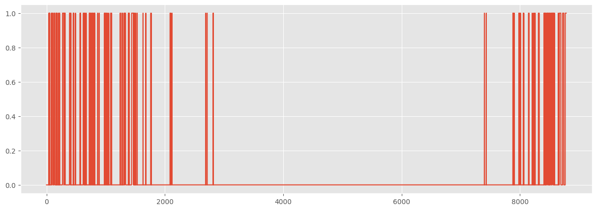
6.2 Use resampling to find the snowiest month
If we wanted the median temperature each month, we could use the groupby_dynamic() method like this:
# group_by_dynamic function requires the key to be pre-sorted
if not weather_2012['Date/Time'].is_sorted():
    weather_2012 = weather_2012.sort('Date/Time')
weather_2012 = weather_2012.set_sorted('Date/Time')

temp_by_month = weather_2012.group_by_dynamic(
    'Date/Time',
    every='1mo'
).agg(pl.col('Temp (C)').median())
plt.xticks(rotation=45)
display(temp_by_month)
sbn.barplot(temp_by_month, x='Date/Time', y='Temp (C)')| Date/Time | Temp (C) |
|---|---|
| datetime[μs] | f64 |
| 2012-01-01 00:00:00 | -7.05 |
| 2012-02-01 00:00:00 | -4.1 |
| 2012-03-01 00:00:00 | 2.6 |
| 2012-04-01 00:00:00 | 6.3 |
| 2012-05-01 00:00:00 | 16.05 |
| … | … |
| 2012-08-01 00:00:00 | 22.2 |
| 2012-09-01 00:00:00 | 16.1 |
| 2012-10-01 00:00:00 | 11.3 |
| 2012-11-01 00:00:00 | 1.05 |
| 2012-12-01 00:00:00 | -2.85 |
<Axes: xlabel='Date/Time', ylabel='Temp (C)'>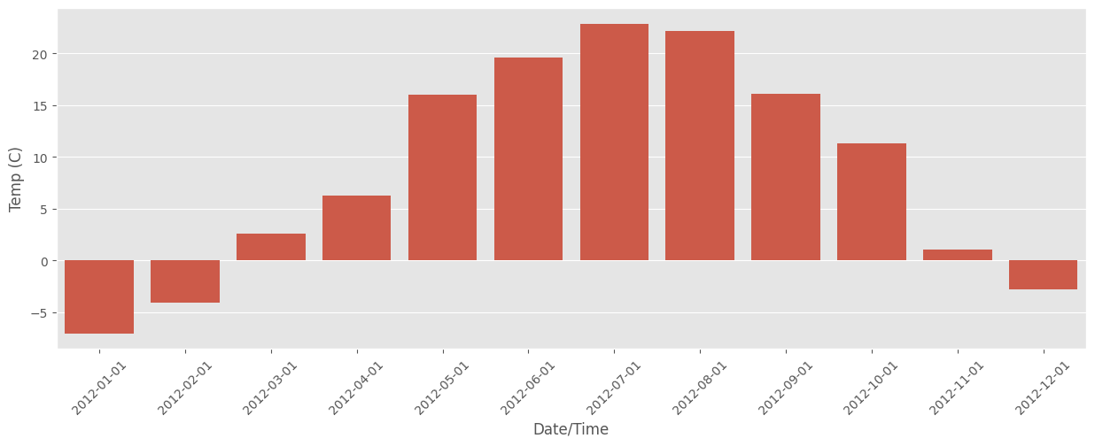
Unsurprisingly, July and August are the warmest.
So we can think of snowiness as being a bunch of 1s and 0s instead of Trues and Falses:
is_snowing.cast(pl.Int8).head(10)| Weather |
|---|
| i8 |
| 0 |
| 0 |
| 0 |
| 0 |
| 0 |
| 0 |
| 0 |
| 0 |
| 0 |
| 0 |
and then use groupby_dynamic to find the percentage of time it was snowing each month
snow_by_month = weather_2012.group_by_dynamic(
    'Date/Time',
    every='1mo'
).agg(
    is_snowing=pl.col('Weather').str.contains('Snow').cast(pl.Int8).mean()
)
snow_by_month| Date/Time | is_snowing |
|---|---|
| datetime[μs] | f64 |
| 2012-01-01 00:00:00 | 0.240591 |
| 2012-02-01 00:00:00 | 0.162356 |
| 2012-03-01 00:00:00 | 0.087366 |
| 2012-04-01 00:00:00 | 0.015278 |
| 2012-05-01 00:00:00 | 0.0 |
| … | … |
| 2012-08-01 00:00:00 | 0.0 |
| 2012-09-01 00:00:00 | 0.0 |
| 2012-10-01 00:00:00 | 0.0 |
| 2012-11-01 00:00:00 | 0.038889 |
| 2012-12-01 00:00:00 | 0.251344 |
plt.xticks(rotation=45)
sbn.barplot(snow_by_month, x='Date/Time', y='is_snowing')
<Axes: xlabel='Date/Time', ylabel='is_snowing'>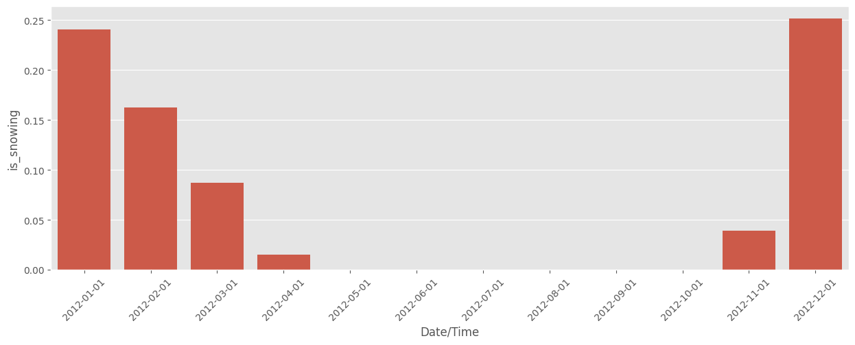
So now we know! In 2012, December was the snowiest month. Also, this graph suggests something that I feel – it starts snowing pretty abruptly in November, and then tapers off slowly and takes a long time to stop, with the last snow usually being in April or May.
6.3 Plotting temperature and snowiness stats together
We can also combine these two statistics (temperature, and snowiness) into one dataframe and plot them together:
by_month = (
    weather_2012
    .group_by_dynamic(
        pl.col('Date/Time').alias('Date'),
        every='1mo')
    .agg(
        pl.col('Temp (C)').median(),
        pl.col('Weather').str.contains('Snow').cast(pl.Int8).mean().alias('is_snowing'))
    .sort('Date')
)
display(by_month)| Date | Temp (C) | is_snowing |
|---|---|---|
| datetime[μs] | f64 | f64 |
| 2012-01-01 00:00:00 | -7.05 | 0.240591 |
| 2012-02-01 00:00:00 | -4.1 | 0.162356 |
| 2012-03-01 00:00:00 | 2.6 | 0.087366 |
| 2012-04-01 00:00:00 | 6.3 | 0.015278 |
| 2012-05-01 00:00:00 | 16.05 | 0.0 |
| … | … | … |
| 2012-08-01 00:00:00 | 22.2 | 0.0 |
| 2012-09-01 00:00:00 | 16.1 | 0.0 |
| 2012-10-01 00:00:00 | 11.3 | 0.0 |
| 2012-11-01 00:00:00 | 1.05 | 0.038889 |
| 2012-12-01 00:00:00 | -2.85 | 0.251344 |
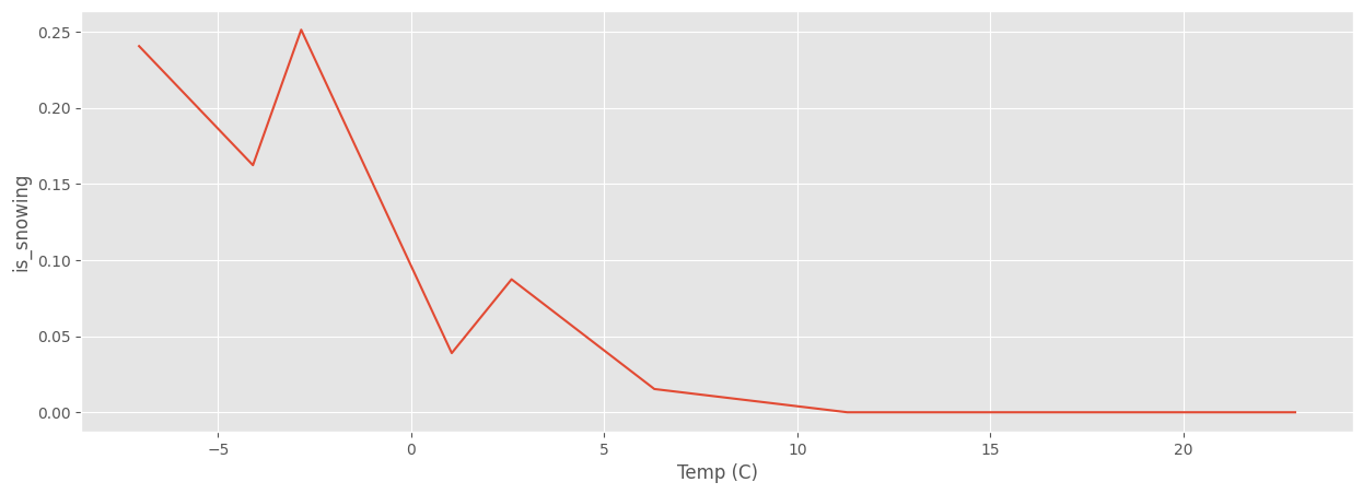
fig, ax = plt.subplots(2, sharex=True)
sbn.barplot(by_month, x='Date', y='Temp (C)', ax=ax[0])
sbn.barplot(by_month, x='Date', y='is_snowing', ax=ax[1])
<Axes: xlabel='Date', ylabel='is_snowing'>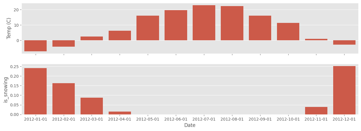
sbn.lineplot(by_month, x='Temp (C)', y='is_snowing')<Axes: xlabel='Temp (C)', ylabel='is_snowing'>